WordPress Developers Take Note: TinyMCE 4.0 Merged Into Core
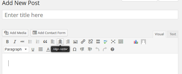
Andrew Ozz who is responsible for maintaining TinyMCE in WordPress has announced that TinyMCE 4.0 has been merged into core. The upgrade contains a number of changes including: New UI and UI API. New theme. Revamped events system/API. Better code quality, readability and build process. Lots of (inline) documentation. Overall improvements everywhere All of the…
